
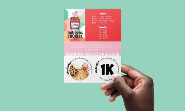
But wouldn’t you know, this incredible woman has become one of my favorite people! It was a joy to work with Sheila over a few months on a project that started out as an updated menu (below) with some stickers and turned into cohesive labels/packaging, new t-shirts, bakery wall art, and an updated website! If you are in the Springfield, MA area… RUN, don’t walk to Hot Oven Cookies!
Since Sheila wanted to keep the existing red oven logo, I wanted to really make sure the updates and new designs we added didn’t look new, but like they were part of the design all along.
So where did all this color come from? Well, it was already in the existing design, I literally just took the eyedropper tool to sample the colors of the red oven, the yellow-ish cookies, and the mint from the cookie cart. From there, I used those same hues to create different values or shades of the colors, and wa-la! Now we have a fun bright palette that coordinates as we transition to the updated branding.
For the packaging, Sheila already had a design that was black white and red. I really liked how the line work from the baking elements worked with the logo, so we created a round and rectangle version for the pint and tin adding color to brighten things up for this fun bakery owner. There was also a need for a write-in label, because I haven’t mentioned yet that Sheila has come up with ONE THOUSAND flavors of cookies that she rotates on a weekly basis (check out their social media to see what’s on the menu this week in addition to their “Always” flavors)!


The original black shirt just had the red oven in the center, but since we were brightening things up, I wanted to add these same elements as before but with our new color palette. I simplified the design a bit to let the illustrated elements shine and not compete with the text of the logo. I created several other shirt options, but one of my favorites was this simple text version featuring a gradient of the updated color palette.


Hot Oven Cookies also had a large blank wall in their new bakery that they wanted to turn into a fun photo opportunity. So we took apart all the original baking elements to create some wall decals. Check out the mockup below!

Finally, the website! This was not part of the original project Sheila reached out about, but after I mentioned that this was one of the additional services I offered, she was on board! I cleaned up what was existing by removing any colors and type that didn't fit with their brand guidelines. There were also a lot of extra pages and confusing navigation I updated. It was a pleasure working with Sheila, and I can't wait to be up in Massachusetts to spend some time with her in the future!